

Case of study
First Sketches
Elena Buysse is a fashion designer based in Venezuela who wants to refresh her personal brand in order to improve its graphic line and align with the mission and vision of the company.
The main audience is people of a high socio-economic class and seeks to express excellence and luxury.
Elena idealizes her brand to be minimalist and with an exclusive style, while keeping the idea of merging the initials “E” and “B” to form a symbol that resembles a butterfly.
Proposals With Color options


Final Logo


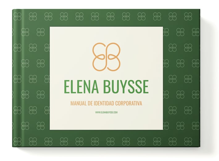
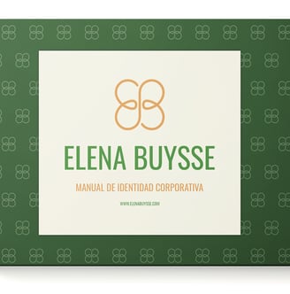
The logo chosen maintains the fusion of the initials “EB” while resembling a butterfly with a minimalist style and a continuous stroke to represent the high quality of the fabrics and embroidery that characterize the brand.
The colors chosen, such as Fern Green for the lettering, Fulvous for the symbol, Vanilla for the background and Eerie Black as a complement, seek to evoke a sense of luxury and wealth, increasing the confidence of those who wear the brand.


For the first sketches I started experimenting with different shapes and fonts, based on a market research done with different brands and competitors both in the country and with international presence. For all the sketches I have respected the idea of the fusion of the two initials while modifying the “butterfly” shape in order to give several different options and better understand what Elena really wants for her brand.
After having chosen three different logos with the shapes aligned to what Elena idealized for her brand, I started to study the different color palettes that could work. Elena prioritized keeping the initial color palette. This resulted in two chromatic palette options.


Case of study
First Sketches
Elena Buysse is a fashion designer based in Venezuela who wants to refresh her personal brand in order to improve its graphic line and align with the mission and vision of the company.
Proposals With Color options


Final Logo


The logo chosen maintains the fusion of the initials “EB” while resembling a butterfly with a minimalist style and a continuous stroke to represent the high quality of the fabrics and embroidery that characterize the brand.
The colors chosen, such as Fern Green for the lettering, Fulvous for the symbol, Vanilla for the background and Eerie Black as a complement, seek to evoke a sense of luxury and wealth, increasing the confidence of those who wear the brand.


For the first sketches I started experimenting with different shapes and fonts, based on a market research done with different brands and competitors both in the country and with international presence. For all the sketches I have respected the idea of the fusion of the two initials while modifying the “butterfly” shape in order to give several different options and better understand what Elena really wants for her brand.
After having chosen three different logos with the shapes aligned to what Elena idealized for her brand, I started to study the different color palettes that could work. Elena prioritized keeping the initial color palette. This resulted in two chromatic palette options.
The main audience is people of a high socio-economic class and seeks to express excellence and luxury.
Elena idealizes her brand to be minimalist and with an exclusive style, while keeping the idea of merging the initials “E” and “B” to form a symbol that resembles a butterfly.


